Warm to Cool: How Color Temperature Shapes Space and Mood
- Jul 8, 2025
- 3 min read
What is Color Temperature?
When it comes to lighting design, color temperature is one of the most powerful—and often overlooked—tools we have. It refers to the warmth or coolness of white light, measured in Kelvins (K), and it plays a central role in how a space feels, functions, and is perceived. The right color temperature can elevate mood, enhance visual comfort, support circadian rhythms, and even influence how finishes and materials appear.
On the Kelvin scale, lower values (around 1800K–3000K) create warm, amber-toned light reminiscent of candlelight or a sunset. Higher values (4000K and above) produce cooler, bluish-white light similar to midday sun—crisp, energizing, and focused.
So how do we choose the right temperature for each space?
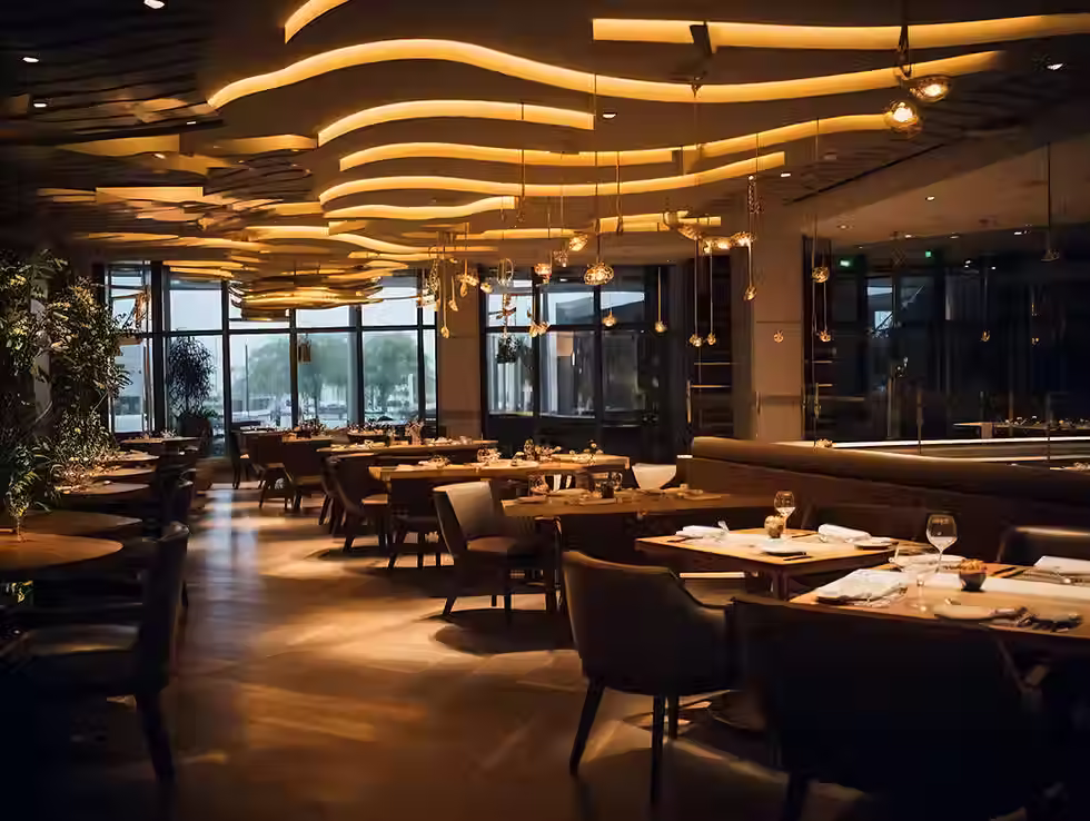
Cooler color temperatures, around 5000K, mimic daylight and are ideal for work environments like offices, hospitals, and classrooms where clarity and focus are essential. In contrast, warmer tones in the 2000–3000K range foster a sense of ease and relaxation—making them a natural choice for homes, restaurants, and hospitality settings.

Designer Tips for Choosing the Right Color Temperature
1. Respond to materials and finishes.
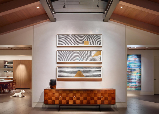
Warm light (2000–3000K) brings out the best in wood, stone, and warm-toned finishes like red, orange, and gold. It enhances texture and imparts a soft, flattering glow—especially on skin.
2. Keep it consistent.
Maintaining the same color temperature throughout a space helps ensure visual harmony. Mixing warm and cool light can feel chaotic or even make fixtures look mismatched or broken.
3. Use cool light strategically.
Cooler temperatures (3500K and above) have their place—particularly in commercial, healthcare, and utility areas. Paired with white or cool-toned finishes, they offer a clean, modern aesthetic.
4. Think about sleep and wellness.
Cool, blue-rich light promotes alertness and is best used in the morning or during work hours. In the evening, shift to warmer light to encourage rest. For those sensitive to blue light, low-blue or circadian-friendly bulbs can be helpful.
5. Minimize light pollution.
Cool light contributes more to glare and light pollution—especially outdoors. For exterior lighting, we recommend fixtures with a color temperature of 2700K or below to protect the night sky.
6. Our go-to guidance.
For most residential applications, we recommend 2700K lighting. We generally advise against using temperatures cooler than 3500K in homes or hospitality settings unless there’s a specific task-driven reason.

The Future of Lighting: Natural Rhythms & Modern Technology
Observe how natural light changes throughout the day—cool and energizing in the morning, soft and golden by evening. These shifts are not only beautiful but deeply tied to our internal clocks.
Innovative lighting technologies now make it possible to replicate these natural transitions indoors. Two key technologies to know:
Warm Dimming: These LEDs mimic the glow of traditional incandescent bulbs, warming in tone as they dim—perfect for creating soft, intimate atmospheres in the evening.
Tunable White: This technology allows for precise control of both brightness and color temperature, independent of each other. It’s ideal for spaces that need flexibility throughout the day, like kitchens, home offices, or multipurpose rooms.
Choosing between the two depends on your goals—and that’s where a lighting designer can help guide the decision.
Takeaway
Color temperature is more than a technical spec—it’s an essential part of how we experience light and space. The right lighting can complement materials, improve comfort, and support health and wellness from morning to night. With careful planning—and a little help from thoughtful technology—you can create lighting that’s as functional as it is beautiful.
Please share and subscribe!
-Written by Vivian Priestley, For Prism Lighting Design


Comments